
by Ben Toalson | Mar 25, 2015 | Case Studies, logos

Who’s Been Married The Longest?
There’s this thing a DJ will sometimes do a wedding where they have a little contest and they say, “Raise your hands if you been married for more than five years,” and a bunch of hands will go up. Then he’ll say ,”Keep your hands up if you been married for more than 10 years,” and some of the hands will come down. He’ll keep going until they get down to the last couple. If Steve and Mary happened to be there, they were always the last couple standing. The DJ would ask Steve, “What is the secret to a long and happy marriage?” Steve would answer with two words… Dolgozz Keményen which is Hungarian for “hard work.”
Words That Define
My client, McLane, commissioned me to hand-lettered those two words in memory of Steve, her late grandfather, and she plans to frame them with a picture of him riding his tractor. McLane says that those two words, Dolgozz Keményen, really mean a lot to her and in many ways come to define who she is. I was just so in love with this sweet simple story that I was really excited to be a part of the project and and see this piece come to life.
Didn’t Use the Word “Love”
It’s funny to me that McLane’s grandfather didn’t use the word “love” to answer the question of what makes for a long and happy marriage. The way to McLean talks about her grandparents–the common heritage they shared, how her grandmother claims to have ensnared her grandfather with lemon pie and cabbage rolls, and seeing pictures of the two of them together–it’s very clear that they were in love.
We can be moved by the feeling of love, but it’s the commitment, the sacrifice, the showing up, and the hard work that keep us in motion
Love In Action
When I think about the things for which we use the word “love”–for our spouse, our children, our creative work–it’s not that fleeting feeling of love that keeps us bound to those things, but it’s something deeper. Certainly we can be moved by the feeling of love but it’s the commitment, the sacrifice, the showing up, and the hard work that keep us in motion. There are so many moments when doing the things that we love and being with the people we love feels like hard work, and it should. In a way, these two words can be used as the verb form of love. It is love in action. “Dolgozz Keményen” your family. “Dolgozz Keményen” your work. If more people meant that when they said the word “love” the world would be a better place.
When you say you love something, show it. Be committed. Make sacrifices. Show up every day. Work hard.
Process Shots:

by Ben Toalson | Feb 17, 2015 | Case Studies, Featured Work, logos
12Rock is a men’s ministry out of Riverside Community Church. Though ministry to men has existed previously, 12Rock was an effort to highlight the ministry’s identity and purpose.
One of the first questions I asked when talking about this project initially was, “What do you hope a new logo will accomplish?” To sum up their answer, they were looking for something that would grab and attract the attention of men in the community and express the unique identity of the group as well as its connection to the main church. Over time this logo would become a visual reminder of memories, experiences and events associated with this group, further solidifying its impact on the hearts of those involved.
The name “12Rock” was chosen for the account in the bible of Joshua commanding the men from each of the 12 tribes of Israel to collect a stone from the Jordan river and assemble them as a monument to the power of God for future generations. Some of the direction I received was that they were looking for something edgy and rugged, conveying “strength” and “band of brothers,” connected to the history and to the branding of the main church, Riverside, while still maintaining a distinctive look. With these cues I took the following approach to designing the logo.
-

-
Sketch Phase 1
-

-
Sketch Phase 2
-

-
Penciled Draft
-

-
Fine Tuning
-

-
Text Only
-

-
Alternative Color Examples
-

-
Reduction Test
-

-
Shirt Design
-

-
Website Implementation Example
-

-
Business Card Design
Connection to the Main Church
In the main church’s logo, the tail of the “R” in “Riverside” swoops below the name to create a river-like feel. I used this subtly, allowing the tail of the “R” in “Rock” to swoop down below the “O”
I also used the unique approach to color in the Riverside logo. Across all riverside branding is a pallet of blues set in a mosaic-like pattern. I used an aspect of the logo (stones surrounding the text) as a way to visually represent this branding, giving the 12 stones the same blue pallet. If the logo is taken to gray-scale, the difference in gray shades still allows the look to be consistent with the Riverside branding, which means alternative colors can be overlaid for use in special events.
Finally, though the logo doesn’t require it, I used the Riverside Header Font, “Roboto Slab,” as the title and sub-title font to further associate the logo with Riverside.
Traditional and Progressive
It was important to the client that the logo both carry an ancient and progressive look. Both the use of stones as a part of the logo and the serif font face used for the “12” offer a traditional feel, while the bold, sans-serif font used for “Rock” (modified Impact font) along with a slight tilt in the angle of the logo offsets the traditional feel with a hint of modernism. With full color and texture, the logo has an edgy feel which also lends to the progressive look.
Global/Local
I chose a circle in which to frame the logo. The circle is used widely in social media to represent an individual person or entity. This is important, as this ministry is, in part, about changing individual lives as a part of a bigger connection. The configuration of the stones in the circle gives it a globe-like feel. Though I didn’t want to go as far as to shape the stones like the continents, I wanted to give a subtle nod to the aspect of this ministry that endeavors to reach the world, while also showing that each individual part makes up a significant and powerful whole.
Diversity
I took care to give each stone its own unique size and shape and was careful not to place stones of the same color right next to each other. This was to underscore the fact that this ministry is not just for one variety of race, background, circumstance or standing, but for all men. This works really well in tandem with the globe-like feel mentioned before. Each individual part, each stone, makes up a significant and powerful whole, therefore each stone is significant and necessary.
Rugged With Soft Edges
Another thing I was careful to do in crafting not only the stones, but the text, was to give them the look of something stone-like and rugged, but with rounded edges. The idea I wanted to convey here is that there is often a difference between the biblical understanding and the secular understanding of masculinity and strength. The stones in the logo are neither perfectly round, nor are they jagged and sharp. Men are sometimes told or taught that they have to be stones with sharp, strong edges or feel like they need to be perfect. The Bible teaches that our strength as men is often found in the softer places and in the way the Lord uses our unique shapes and that we are the most masculine when we are not afraid to let those places show.
“Band of Brothers”
I used the randomness of the stone’s size, shapes and colors to make them look a little like camouflage. This is meant to trigger thoughts of camaraderie among group members, as soldiers holding the front line together. This is a subtle visual gesture to convey the “band of brothers” feel. The viewer may not necessarily recognize it as a camo-like pattern, but it can serve to subconsciously spark that element of brotherhood.

The people and the mission behind this ministry are very close to my heart, and it brings me great joy to think that this logo could be a part of helping them see success in their mission.

by Ben Toalson | Oct 29, 2014 | Case Studies, Featured Work
Initial Meeting and Goals Discussion
When the founders of Quarry met with me to discuss their goals for their logo, they described an organization that would be a shared resource for people entering various places in ministry, providing start-up funds, information, training, teaching and other equipping. Their goal is to remove barriers for people who feel called to something bigger than themselves. They talked about their desire for the logo to express strength, history and community. The idea for Quarry was that a person would be encouraged and equipped in community and then sent out into the world, much like a precious stone being quarried from rock. The strength of this person would not just be in their equipping, but in their connection to and remembrance of the community or “quarry” from which they came. They shared some ideas for imagery, including a quarry, a globe, a book, a lighthouse… but emphasized the previous mentioned strength, history and community. Quarry will serve as a flagship for various manifestations of the brand, so it was important that the branding be able to communicate the overarching purpose, yet versatile enough to be utilized for various sub-organizations.

Sketches
After having taken down notes and spending a few days researching and gathering inspiration, I sat down and began to sketch out some concepts. I was drawn almost immediately to this idea of the “Q” of Quarry being stone-like, and somehow the tail of the “Q” representing an off-shoot (the gem of) the stone or quarry. It seemed to be a natural fit to somehow add latitude and longitude lines to half of the “Q” to make it globe-like, using the tail of the “Q” as the lowest latitude line. In this way I could express the strength, community and history, while also expressing the idea of a person being sent out into the world. The globe also lends to the need for the universal application of the brand across various sub-organizations.

Balancing History with Reaching Forward
For the text representation of the logo, I decided to allow the larger mark and the “Q” of Quarry to be almost identical, and based the rest of the letters on the style of the “Q”. The style of the “Q” was such that I could go with a serif or sans-serif approach to the font. I felt that the sans-serif was causing the name to look a little too modern/futuristic, so I designed serif characters to bring in more of a traditional feel. The rounded box style of the lettering combined with the serifs really balance the text well between the historical and forward reaching expressions of the brand.
Final Hand-Drawn Draft
For the final hand-drawn draft, I used the latitude lines to make a quarry-like layered rock section to the left of the “Q”. Ultimately I decided this was making the logo too busy and was taking away from the significance of the “Q”s tail in being the precious gem sent out from the quarry.

Digitizing
After finishing the hand-drawn draft, I scanned the image and began to work on the digital file. I performed a live trace on the mark and the text separately. After tracing the text I separated each letter out so that I could work on them individually.
The Mark
For the mark, I decided that it made more sense for the globe to be positioned on the right rather than the left of the “Q” as this would have the tail moving toward and through the globe, rather than away from it. I also took some time to balance out the sections between the latitude and longitude lines and changed the orientation of the lines to give the logo a bit more movement. As a last step, I decided to extend the upper two latitude lines just beyond the outer edge of the “Q” to give even more of an impression of motion. Additional, more subtle imagery that plays into the brand are the many intersecting lines that make cross-like shapes. The longitude lines also slightly resemble the flipping pages of an open book. Finally, I decided to frame the logo as a cutout of a round-cornered rectangle at a 4:3 ratio. This and the mark without the rectangle are options for presentation. I chose a blue just a few shades lighter for the main color (Pantone 646 c) to support the strength, community and spirituality of the brand.

The Text
For the text, I recognized almost right away the need for the “A” to be consistent with the “U” and removed the serif at the apex of the “A”. Also, to allow more visual flow, I decided to have the crossbar of the “A” swoop up to keep the resulting horizontal line created by the two “R”s from attracting too much attention. Finally, I went back and made several fine adjustments to widths, kerning and spacing. I chose a yellowish gold that was closer to the orange size of the spectrum (Pantone 124 c). It is only a few shades off of complimentary for the chosen blue and is an eye grabbing combination. The yellow/gold/orange combination communicates courage, value and a daring that supports the audacious nature of the person surrendering to calling that is bigger than them.

Versatility In Action
Below the main text is where the names of the sub-organizations will appear. For this I chose Gotham, a simple sans-serif font, widely kerned and positioned below the text at the same width. I chose a darker grey (Pantone 425 c) to give the text enough presence to be seen, a similar depth to the colors in the main mark and text, without taking away from the others.

The final result is something that will work well across multiple mediums and for a variety of ministry pursuits. Here are a couple examples of the logo in action:


by Ben Toalson | Jul 16, 2014 | Case Studies, Featured Work, In The Boat, portfolio
Goals and Summary:
The goal of the logo is to convey the rich history of the dance hall, while highlighting the fun, light-hearted, community spirit that people experience when they hold and attend events there. A refresh of their branding will help Anhalt Hall to stand out more prominently in peoples’ minds when they consider where they’d like to have their next party, wedding, family reunion, etc. resulting in a more steady inflow of new and returning patrons.
I designed a logo that dances across whatever medium it uses. I intentionally gave some of the letters a subtle characteristic of dancing feet so the logo would express the vibrancy one experiences in the dance hall. I hand crafted a German type style font that matches the historical feel of the venue with a light-hearted spirit. For the secondary text I used a simple, rounded, sans-serif font with a little bit of German flavored decor to anchor the rest of the piece. It says to its beholder, “Come on in! Willkommen… if you will. We’ve been around for awhile and we know how to have fun. In here are good times and fond memories.”
Content:
Main Title – Anhalt Hall
Secondary Text – Est. 1875
Secondary Text – Germania Farmer Verein
Mediums:
Road signs, Banners, Website, Business Cards
Mood-Board:
These are some of the pictures and images I collected while I was gathering inspiration for this logo.
[prw username=”bentoalson” boardname=”mood-board-for-anhalt-hall-logo-design” maxfeeds=”12″ divname=”myList” printtext=”0″ target=”newwindow” useenclosures=”yes” thumbwidth=”200px” thumbheight=”100px” showfollow=”none”]
Process:
-Sketch & Selection

I first sketched out several different ideas. In the end there were a few that really stood out to me. I went with the layout I liked the most and pulled some type styles from a few of the others.
-Draft & Digitize

1. I did a rough sketch of the idea that I liked the most, to confirm that I wanted to go that direction stylistically.
2. I drew and inked a final version that I then scanned into my computer.
3. I used Adobe Illustrator’s “Live Trace” feature to get the lines as close as possible to the original intent.
4. I cleaned up the wavy lines and stray points to make the logo more fluid.
-More Adjustments

5. After struggling with the layout, I decided to use a different arrangement from the preliminary sketch phase and adjust the entire thing. I also started focusing on kerning and making other adjustments to design how the spaces between the letters would interact.
6. I made adjustments to the overall curve of the logo, making sure it followed the curve of the composition more precisely to make for a better visual. I also made more adjustments to kerning.
7. Finally, I made detailed adjustments to each letter to bring out characteristics I wanted to highlight.
-Final

The final piece includes the establishment year and original title of the gathering that founded the hall.

This is a fun variation that overlays a picture of the interior string lights (a key feature of the dance hall).
Package and Delivery:
-PMS color values
Main Color: PANTONE BLACK 7 C
Highlight Color: PANTONE 7515 C
-examples
Entrance Sign:

Business Cards:


by Ben Toalson | May 5, 2014 | Case Studies, In The Boat, portfolio

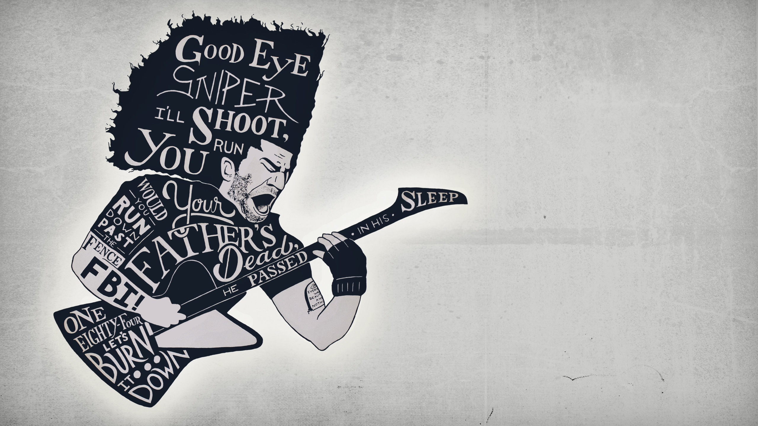
Free Wallpaper Download (2560×1440)
Commissioned Hand Lettering Piece
I was recently commissioned to do an art piece in a style I am growing very fond of which combines illustration with a form of lettering that uses negative space to form the letters. I was asked to use the picture below of Claudio Sanchez, front-man for Coheed And Cambria, as inspiration and to hand-letter on this image the following lyrics from four of their songs:
“Good Eye, Sniper. I’ll shoot, you run”
“Would you run down past the fence? FBI!”
“Your father’s dead, he passed in his sleep”
“One Eighty Four, lets burn it down”

Gathering Inspiration
The first thing I do is to take some time to study my subject. I listen to the songs, imagining how the style might manifest itself into a unique expression of each word. I learn about the band, their origins and the music they’ve produced over the years. I learn about the fans and the culture that has grown around this band and the stories and messages of their music. I spend about a week doing this before I even put pencil to paper.
Writing Out The Lyrics
Simply writing out the lines that I will be lettering helps to clear my mind of any preconceived ideas I might have about how the words should be arranged or what styles the words should take. In this step I make marks and boxes, sometimes combining words or matching words I feel should have equal emphasis.

After getting a feel for the pacing of the words, I write them out again, this time making line breaks to separate the words and word combinations, further defining the hierarchy. I am careful not to think too far ahead to how the words might be arranged in the image, so that the hierarchy remains intact.

Preliminary Word Placement
This is actually one of the places where I can tend to get a little stuck. The question bounces around in my head, “What if I put the words in the wrong place?” I could sit and stare at that outline all day long, but instead I accept that my first attempt at placing the words is probably not going to look anything like the end product and that sets me free to just draw. I sketch, erase, sketch, erase, mark out, etc. until I feel like I’ve got something close to what I imagine the finished project will look like.

More Placement Work
Now I’ve got a better idea of where the words fit into the composition and my goal is to continue working until I’ve come as close to what will be on the final draft as possible.

Half Size Drafts
These drafts are much closer to the final version. They are 12″ x 12″, half the size of what the final version will be.
1st Draft
This draft focuses specifically on the letter styles and further hones in on the word placement. I only use pencil so that I can make erasures and discover more quickly what the final layout will look like. This is the last step in which I might make placement and style decisions. After this one, they are set.

2nd Draft
This draft is meant to basically be a smaller version of the final. I focus on every detail and ink it as I will the final. This draft is great for helping me to work through my jitters and get the mistakes out of my system, as well as helping me become even more familiar with the styles and placement.

Final Piece
Using the 2nd draft as a reference I use a grid system to transfer and lightly sketch the half size image to the full size page.

As I did with the 2nd draft, I take the following steps:
1. Draw grid/guide lines
2. Lightly sketch the outline and basic details
3. Write the words more or less where they will appear
4. Go back phrase by phrase and draw each letter
5. Make final adjustments, erasures and re-sketches before going to the inking phase
6. Slowly and meticulously outline each letter, just on the outside edge of the letter. Here I also line the outline and other drawn elements
7. Erase the pencil lines leaving only the ink
8. Slowly and meticulously outline each letter with a thicker line that will serve as a buffer for the filling that I also do in this step
9. Draw the face detail and fill in shapes and lines
10. Make any minor necessary adjustments and final erasures
11. Sign it
Here is a time-lapse video that condenses the 7.5 hours I spent on this draft alone into 5 minutes. I also composed an original instrumental song to accompany the video. The song is called “Falling Through the Center.”

Package and Ship It

I include the 1st and 2nd drafts, the final piece, and a hand-written note, wrap it up carefully with edge protectors, bubble wrap and packing peanuts to ensure that the contents make it to the client unharmed. As a bonus for the client, I create and send an HD wallpaper along with the final message and invoice.
I Can’t Wait to Do This Again
I will continue to work on personal projects in this same style and already have several in mind, some for which I will make case studies like this.
For more content like this you can check out my process page that talks about the process I use for designing logos or websites, or you can check out another case study from a logo project I took on a few months ago.

by Ben Toalson | Jan 20, 2014 | Case Studies, Featured Work, In The Boat, portfolio
I had been looking into getting a full-time job as a graphic designer at First Presbyterian Church in San Antonio, TX. The initial interview went well enough that they asked me back for a second interview. For the second interview they asked the remaining candidates to design a logo and showcase our skills for “Loaves & Fishes”, a ministry of First Presbyterian that provides a monthly meal for the homeless and hungry in their community. The final presentation would be due at the second interview which gave us one week to complete the project.
To be honest, initially I was a little hesitant to move forward. This felt a little like spec work and I had already had a few bad experiences with spec work in the past. As I thought on it more, however, I decided that I would treat it like a pro-bono piece and make it, at the very least, a useful portfolio piece and case study for my website, and at best, a piece that would afford me an opportunity to take a cool job. I also decided that I would do a hand lettering piece to accompany and possibly include the logo.
Spending quality time with the content and goals
My process began with reading the church’s very thorough description of their goals and content. Feeling confident that I had all of the information I needed, I simply wrote the words “Loaves & Fishes” on a blank page in my composition notebook. I let the words sit there on the page and in my mind for a little bit. As I thought on it, an idea popped into my head for the hand-lettering piece… “Let my hands & my heart be like loaves & fishes for the world.” I thought this phrase really captured the nature of the Loaves & Fishes ministry and, though at the time I didn’t know it, would later become a springboard for the direction I would take with the graphic representation of the logo.
With a few words hanging out on a page and in my head, I continued to dig a little deeper into the goals of the project, allowing some research to confirm what my experience and expertise told me would be a good style direction for the logo. Then I went back to the paper.
Sketching out some ideas
This opened up the sketch phase of my process which is one of my favorites. Here I let my pencil loose on the page, exploring different ideas and concepts.

I worked first on the hand lettering piece and as I was working out word arrangements, I kept getting an image of slab serifs for the “Loaves & Fishes” part of the phrase. The audience is very diverse in this case, but communication efforts in church are often geared toward drawing generations together toward a common purpose. I knew the design needed to appeal to younger and older generations, but not just to be an appeal, but a strong call to action. The slab serif has an air of traditional style, but has also recently taken on modern associations. It is a strong typeface that grabs attention, which I later underscored with a thin line shadow to make the words slightly more assertive. I like that the little imperfections in the hand-drawn style pull it in a more tactile direction and draw out the human, hands-on nature of the Loaves & Fishes ministry. I decided that this would be a great direction for the actual logo which meant that my hand lettering piece would actually include the final logo.

When a fish is not a fish
For the graphic representation I sketched out several different ideas before, almost by accident, I made a connection between the five loaves and five fingers of a hand, and how the fish, if arranged in the right way, could resemble a heart. This ministry is about offering hands and hearts (and food) so that Jesus can multiply those gifts in others.

I really liked the idea, but knew that making it overly obvious would highlight the cleverness of the idea more than the ministry itself. I opted to go with a more subtle representation of the idea, with a solid filled illustration outlined by negative space and nestled in the shape of a circle. A solid fill is generally more pleasing to the eye and also makes shapes and forms more memorable. The simplicity of the lines by way of negative space give just enough visual information for the viewer to discern what it is, without cluttering up the illustration. The circle has long been a strong relational symbol and is more recently being widely adopted by social network applications as a standard avatar frame. The association between the circle and the human face continues to grow stronger and further relates this shape to the human experience, which I believe is very applicable to this logo. I decided to maintain the hand-drawn style to be consistent with the typeface which lends further to its humanness.

Once I arrived at a brainstormed solution, I took what I sketched out in various places all over my composition notebook and began to do a final draft of the piece in my artist’s notebook.
An in depth look at how I took this piece from a sketch concept, to a completed digital design
I begin by penciling the piece:
1. Quick Sketch: First I sketch out each word very lightly, focusing on the layout rather than the more detailed elements.
2. Guidelines: After I’ve erased and made adjustments and every word is where I want it to be, I draw guide lines, often using a ruler, to give the piece more structure.
3. Detail Sketch: I go back over each word and sketch out the letter forms, focusing this time on the detail and character of each letter. I erase and make adjustments until every letter is perfect.
4. Zoom Out: I find that when working in detail, I hover very close to the page. Funny as it sounds, my eyes miss things up close that I can see very clearly from far away. It may be something to do with the balance, tracking or kerning, line height, etc. If I need to make adjustments here I will, even though I could fix it digitally, because this is the last opportunity I have to make it perfect before I seal it in ink. I will often use this as an opportunity to make adjustments based on design decisions, bringing the piece into further alignment with the goals of the project.

After the penciling stage is finished I begin to ink the piece. Here’s how that goes:
1. Outlining: I go over the outline of each letter very carefully with a very thin pen (micron 001). I find it best during this phase to not even think of the letters as letters, but to regard each line and stroke. If I make a mistake I may zoom out to see if it’s something I can compensate for somewhere else. If it’s not something I can fix, I get over it and get back down to outlining. This is, for me, the most stressful part of the process. I often put on some headphones and listen to a podcast or some music, which helps me focus more on the lines and less on the content.
2. Erasing: I erase the pencil lines that I no longer need and an outlined version of the piece is revealed. I take a deep breath and enjoy the fact that the stressful part is over.
3. Filling in: I zoom in again and fill in each letter, backing out every so often to see if there are any minute adjustments I need to make. I have to remind myself to slow down here because I get excited being so close to seeing the finished inked piece.
4. Final erase and adjustment: I erase any remaining guidelines and outlines and zoom out to see if there are any other minute adjustments that need to be made. If it’s done I stare at it for no less than 60 seconds with absolute silence.

When the inked piece is completed I work on a final digital draft:
1. Bringing it into digital world: I either scan or take a high res photo of the piece and send it to myself
2. Cleaning up: I first bring it into Photoshop where I add contrast where necessary and isolate the inked portion of the page.
3. Preparing the image for vectoring: I make small adjustments if needed and add a layer of solid black to cover the letters and design elements in the piece so that there is absolute contrast between black and white.
4. Vectorizing: I bring the layer into Illustrator and run a live trace on the piece using the options to find the best representation of the words and forms.
5. Cleaning it up: Still in Illustrator I go through letter by letter and shape by shape to make line adjustments and to clean up the vector. With really precise pieces I may take a great deal more time to make all of the lines and shapes perfect, whereas with pieces that will maintain more of the “hand-lettered” look I will allow many of the imperfections to stay, only making adjustments to serve the piece as a whole.
6. Final Arrangement: I bring it back into Photoshop as a single shape layer and will often break the piece up word by word so that I can make any necessary adjustments to spacing or size. This also helps if I want to apply different colors to different words.
7. Coloring: I make color selections and take care in applying colors to different elements, keeping in mind the project goals and target audience.
8. Texture and image overlays: This is for use mostly in my personal pieces, but can be a fun exercise to include in presentations. Sometimes I will add texture to the words or the background or both. Sometimes I will allow the words to sit over an image. Whatever I do, I always make sure that the artistry does not take away from the readability of the words in the piece.

That’s it!
The finishing touches, or as I like to call it, the last 40% of the project
After scanning the piece, outlining it for vector and making final line adjustments, the piece was more or less done for black and white… Here I began the process of adding color and, where applicable, texture and image.

For the colors I went with a bold, yet natural palette. Bold to support the strength of the statement and natural to support the human element. It was somewhat important for the fish and the loaves not to have bizarre colors. I went with a muted dark reddish-brown for the fish/heart and a muted yellowish brown for the loaves/hand. The red serves as a great attention grabber and can be used for a main heading while the yellow can be used for pulling out highlighted content in body text. I brought in a couple of blues for the circle/plate to give a feeling of comfort and authority and also to tie it into First Presbyterian’s main logo. The darker blue can be used in the other headings and in paragraph text because of its high contrast against white. As a side note, red and yellow are widely used in the food industry to create feelings of hunger, so when people see this logo they may actually have a physical empathetic hunger response, making it more likely that they would want to commit to participating.

I decided to add some texture distressing to the logo to make it a little edgier and appealing to a younger audience, but was careful not to go overboard with it in order to keep it well within reach of a diverse audience.
For accompanying fonts I went with fonts that were already widely used on their website to create a sense of familiarity and belonging for the new logo. The two fonts chosen are sans serif fonts which accompany the slab serif in the logo very nicely as if to say “alright, now here is some information.” FjallaOne is a strong condensed font that shows nicely for headings. It is naturally bold and does a great job of creating visual hierarchy. Myriad Pro is very easy to read and makes for natural looking paragraph blocks, allowing the reader’s eyes to glide easily through the content.
Packaging it up
The final package delivered to First Presbyterian included the following:
-process shots
-the final hand lettered piece
-the logo in simple form (black and white, no texture)
-the logo in its finished, full color form
-pantone guide including numeric values
-type rules including hierarchy, font and color
-a two page document detailing my process and design decisions (which included much of the content found in this case study)

As is true with many ministry titles that find their origins in Biblical accounts, there are many “Loaves & Fishes” out their. Because many churches are working toward the same purpose, it is not surprising that different churches would share many similarities. However, though there are many churches who have similar ministry titles, church names etc., each church is unique and has a unique expression of ministry. I believe this logo captures the unique identity of First Presbyterian Church and expresses their unique ministry through Loaves & Fishes. I believe it will serve as an encouragement for many of those who call First Presbyterian their home to share their loaves/hands and fishes/heart with the homeless and hungry in their community.


